In a sequence you’ve called ‘colour’ of whatever project you’re working on, you will have clips that are indicative of a particular colour or lighting state. (At least one of them should have a person in it – for skin tones) To the right of that clip you will have that same clip repeated 3 or more times with different colour grades on it. Take screenshots of each clip then upload to your blog the series of stills that show us ‘before and afters’ of your colour grading. Hint – google – before and after colour grade. Each with a description of what you did to the clip and why. Provide at least 3 clips with 3 grades on each and include the original. This is a learning exercise, not a qualitative one, don’t stress – it is the act of doing it and the reflection on that, that is important
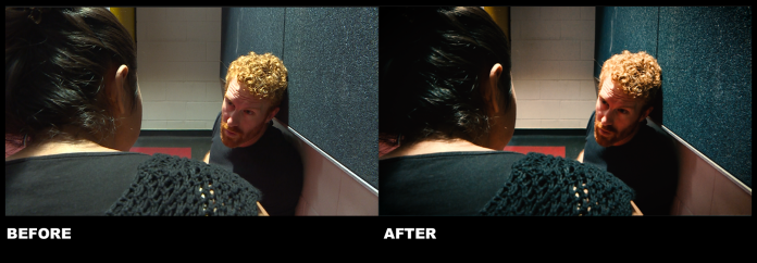
Clip 1
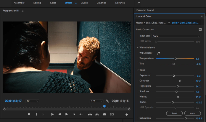
This clip below is taken from the Lenny’s shot construction exercise.


1.1 Teal and Orange look
Step 1
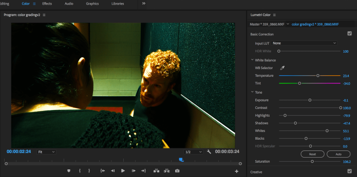
So, here is the first look that I created for my first clip. First, I did the colour correction such as the white balance, exposure, contrast, highlights, shadows, and any other components. Because I wanted to make it a bit warm so I played with the temperature and bring it up to about 42,4. Then I bring down the blacks a little bit around -4.3, and used the curves section to further refine the look using RGB Curves.


Step 2
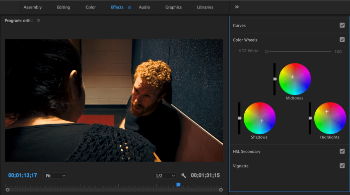
After I feel the colour is balanced enough, I started to experiment with the color wheels. I applied some blue in the shadows, a little bit orange for the highlights and pull the Midtones to orangish and red side. I just tried to pull things back and pull things to be more strong to balance out the three adjustments. Because I wanted to get the warm vibrance so that the clip looks a little bit more of that moody look.
Step 3
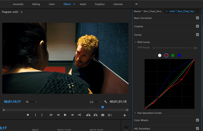
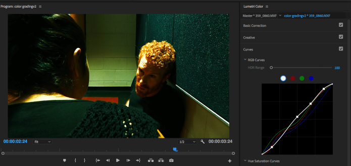
After I adjusted the color wheels, I go back to RGB Curves and did some experiment with each of the color as seen in the picture below. The clip is became more bluish.
Final step, I go back to the basic correction and change the temperature, adjusted the contrast, shadows and added some vignette to make the corner of the frame a bit darker.
Final Look
1.2 Dark teal blue look
In the first version, the look is more teal and orange. So, I wanted to create another version of teal look. Since I wanted to create the look somewhere between dark blue and green, I just named it dark teal blue look.
Step 1
To create this look, I chose the SL Blue steel presets as my foundation from the Look section in creative settings.
Step 2
Because the color is a bit pale for me, Then, I started to play with the basic correction. I set the temperature to 12, bring the blacks down to -5.4, increase the saturation to 117,4, contrast to 25, white to 20,7, and exposure to 0,3. Also, I modified the RGB curves and tried to experiment until I get the look that making color casts more dramatic.


1.3
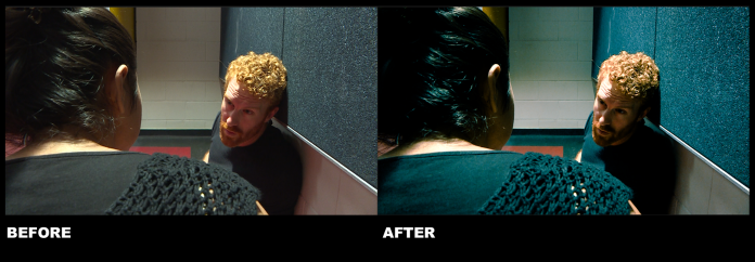
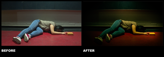
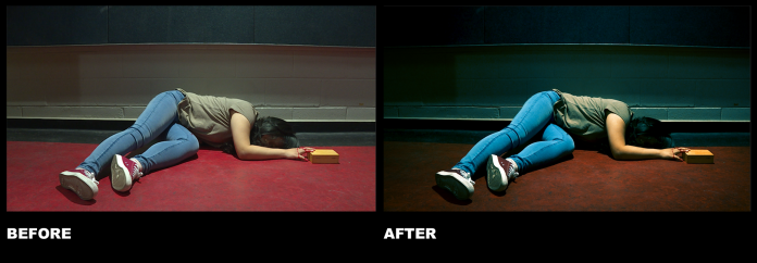
I’d like to experiment with the colour and I prefer green color because I think it is kind of represents a destruction. So what I did is I bring the tint down to -34 so that the dominant colour would be green. As seen in the picture above, it is really green. Then, I played around and experiment with the RGB Curves. Below is the screenshots of what I did in the colour correction including RGB Curves.
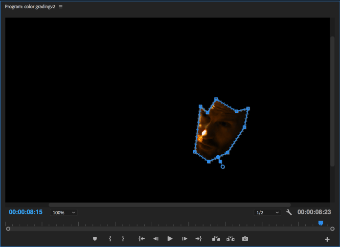
I like the green background but the problem is the face is a bit too orange and a bit dark for me. So I wanted to make the skin tone looks more natural but I don’t want change the colour of the background. So I go to Effect Control—>Opacity—>Free Draw Bezier and used the mask features to change the skin tone and make it look a bit natural by doing the face mask. Then, I tried to experiment with the exposure, saturation and the HSL secondary so that the face is not too orange.
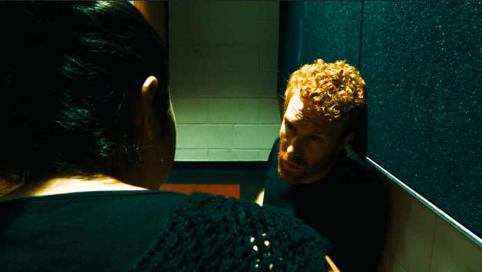
The picture above is the final results. As we seen in the picture, the skin tone is not as orange as in the previous clip.
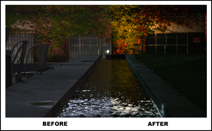
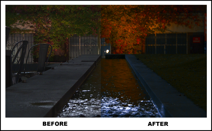
Clip 2
This clip below is taken from the one of the Abstract Videos.


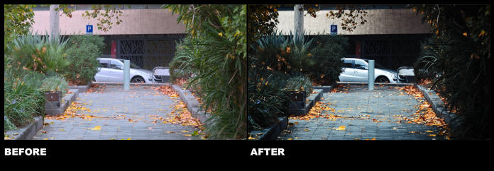
2.1. Warm look

After I balanced the clip by bringing down the highlights around 55 and the shadows down a little bit. As seen in the picture it is more darker now. I wanted to make a feel of Fall in this scenes. So, I warming up the mids first. Then, used the Hue saturation curves to get the nice leaves colour and really bring out the warmth of the leaves. For the final touch, I applied basic adjustments to this clip such as adding some contrast and saturation just a little bit to make the leaves color pop up more.
2.2 Mysterious look
I wanted to make it a bit blue so adjusted the color temperature towards the blue a little bit more and lower the vibrance a little bit. I like the shadows to be deep and the edges to be sharp so I adjusted the shadows and slightly used the blacks for darken the blacks part of the clip (it’s also because I don’t really want to see the background behind the car). Then, I tweaked the exposure a little bit. Also, I played with the Hue saturation curves just the yellow and orange part to make the leaves looks more dramatic and a bit orange compared to the original clip. Final step, I adjusted the saturation level to help everything blend in a little bit more.
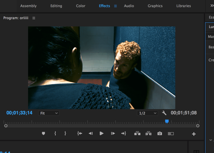
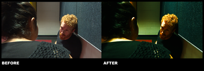
2.3 Day-to-Night look
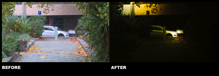
For the third versions of this clip, I’m actually a bit unsure if I am allowed to darken the clip as seen in the picture above. But I just want to experiment with it by changing it from day time to night time.
Step 1
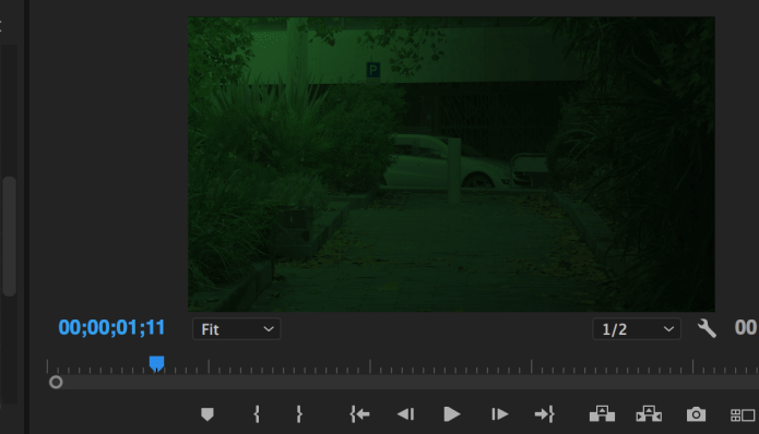
So, I what I did is first I created an adjustment layer. Adjustment layer allows me to apply the effect (color and tonal) into the clip without permanently change it. Also, it gives me a little bit more flexibility that makes it easier for me to experiment with color of the clip. So I put the adjustment layer on top of my clip. After that I created 4 lights for this clip and I set the first light to green as the base light.
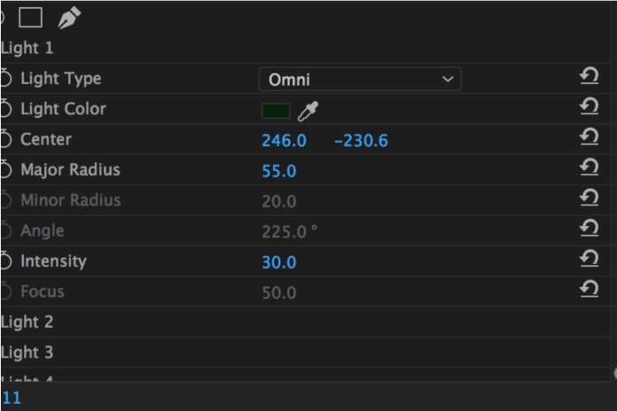
Step 2
Then, I set the colour for the other lights. Since there is an utility pole in the clip, so I put the 2nd light right below the utility pole and I set the colour to yellow. Next, I set the light as the car lights as seen in the pictures.


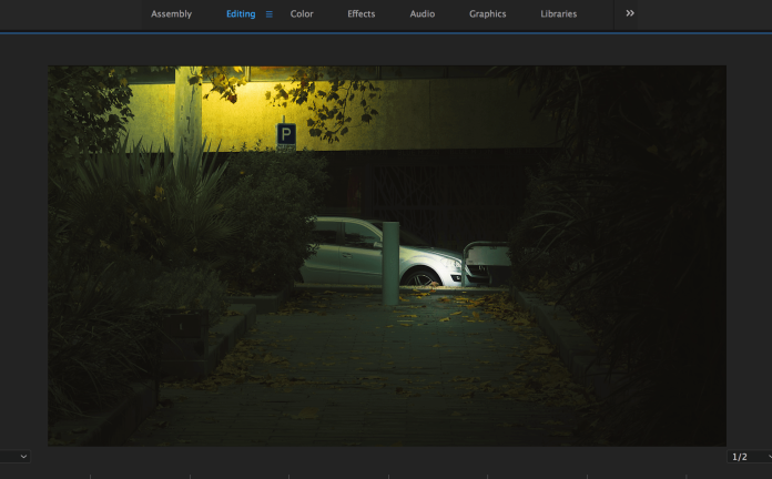
After I changed the light color to yellow (for utility pole only) *Light type: Omni
Step 3
After I set all the lights, I created another adjustment layer to play around with the exposure, blacks, contrast, saturation of the clip. So I lower the exposure a little bit and darken the clip by dragging the blacks into -62. Then, I raised the saturation and contrast just a little bit. Below is the final look of the clip. In my opinion, the light under the utility pole is actually a bit weird and too bright at this point but it was fun playing around and experiment with the color.
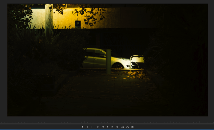
Final Look
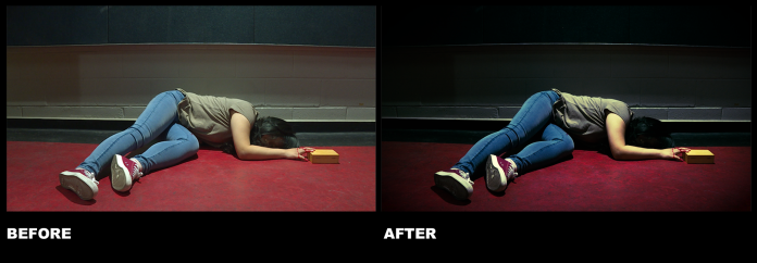
Clip 3


Effect used in this clip:
- Basic correction: Slightly bring the temperature became more yellow, decreased shadows and whites, and dragged the tint toward the green a little bit.
- 2 lights: I used the same technique as the clip 2.3 above but I only used 2 lights in this clip. So I put one light on the wall and one light on the box (in order to make the box pop up).
- Vignette: Add vignette to make it more darker in each corner of the clip.
3.2
Effect used in this clip:
- Basic correction: I wanted to make the suspense feel so I bring my exposure down, dragged the temperature towards the blue a little bit more. Also, I increased the contrast and saturation.
- Curves: I wanted to experiment with the color so, in the color wheels, I tried to pull the shadows to blue and play around with the midtones and the highlights. So the color is mixture between blue and green. Then, I adjusted the RGB curves until I get the look that I want
- I also slightly applied Fade effects.
3.3
Effect used in this clip:
- Basic correction: significantly increased the blacks and the the slightly increased the contrast. I like the blacks to be really deep, slightly adjusted the highlights
- Vignette: Add vignette a little bit.
Clip 4
Effect used in this clip:
- Basic correction: significantly increased the blacks and the shadows to create a dark look. Then, increased the whites a little bit, slightly increased the contrast and adjusted the highlights.
- Curves: created a slight little S curve in the white section in RGB Curves. Also, I think the leaves color is a bit dull so I played around with the red and green color in Hue saturation Curves to make it more pop up. Then, slightly dragged down the white RGB Curves.
Effect used in this clip:
- Look from the creative: I applied the ‘SL Gold Orange’ presets look from creative settings.
- Basic correction: Significantly increased the highlights to 71,3, slightly increased the shadows to 16 and whites to 21,5. I wanted to be a bit dark so I dragged the black down to -5,3. Then, I just adjusted the exposure a little bit.
